Category:

Inspiration

Advertising

Tucked away in the elegant streets of London’s Bloomsbury district, a once-unassuming Georgian flat has been reborn into a masterclass of visual storytelling — where centuries-old textiles and daring contemporary art meet in quiet, layered conversation. The result is a home that feels less like an interior project and more like a living gallery: tactile, expressive, and alive with history.


A Building Steeped in Character

The flat occupies the first floor of a Georgian terrace built in the early 1800s — the kind of building with tall sash windows, intricate plaster cornices, and creaking floorboards that hum with the memory of passing centuries. When the current owner, a textile historian with a passion for modern art, first stepped inside, the rooms were faded but remarkably intact. “There was a kind of quiet dignity in the space,” she recalls. “I didn’t want to erase that. I wanted to work with it.”

The renovation would become an act of preservation and reinterpretation — respecting the building’s period character while weaving in new layers of artistic energy.


The Vision: A Dialogue Between Eras

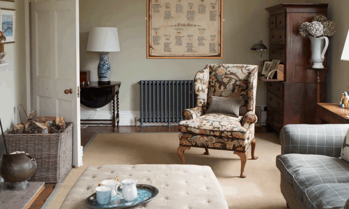
Rather than impose a single aesthetic, the design team embraced the idea of contrast: pairing handwoven 19th-century fabrics with bold, abstract works by contemporary artists. Each room was conceived as a chapter in a larger narrative, where textures, patterns, and colors build upon each other to tell a story.

Walls were carefully restored, not smoothed to modern perfection but left with a slight patina that reflects their age. High ceilings and original moldings set the stage, but what brings the interior to life are the unexpected juxtapositions: a centuries-old embroidered wall hanging beside a neon installation, a fragile silk damask curtain framing a modernist sculpture.


Restoring the Bones of the Flat

Before anything could be installed, the structure itself needed careful attention. Years of neglect had left the plasterwork cracked and the wooden floors uneven. Conservation specialists were brought in to stabilize the building without stripping it of its historic charm. The original oak floorboards were gently sanded, oiled, and left bare, their knots and imperfections celebrated rather than concealed.

The sash windows — essential to the building’s character — were fully refurbished, restoring their smooth gliding mechanisms and improving insulation without compromising their elegance. Subtle modern interventions, such as concealed underfloor heating and soft ambient lighting, make the flat comfortable by contemporary standards without intruding on the period architecture.


Textiles as Narrative

At the heart of this project lies a remarkable collection of historic fabrics. The owner spent years collecting antique textiles from across Europe — damasks, silks, velvets, and hand-stitched tapestries — many dating back to the late 18th and early 19th centuries. Rather than lock these pieces away in storage, she wanted them to be part of daily life.

One of the most striking elements is a floor-to-ceiling panel of hand-embroidered Ottoman silk, displayed like a work of art in the living room. It’s mounted within a slim brass frame, illuminated gently from above, allowing the metallic threads to shimmer in the evening light. Elsewhere, fragments of antique paisley shawls have been transformed into cushion covers and wall panels, integrating seamlessly with contemporary furniture.

In the bedroom, original French brocade was used to upholster a custom headboard, giving the space a sense of hushed opulence. Every fabric carries a story — of its makers, its previous homes, and the centuries it has survived.


Art that Interrupts and Complements

To balance the historic richness of the textiles, the owner curated a collection of modern and contemporary artworks that offer a counterpoint rather than a complement. A dynamic black-and-white canvas by Bridget Riley hangs above a gilt-framed mirror. A vibrant sculpture by Anish Kapoor commands attention in the hallway, its smooth curves contrasting with the intricate damask wallpaper behind it.

These pieces are not decorative accessories — they are active participants in the space. Their boldness energizes the rooms, preventing the historic fabrics from tipping into nostalgic pastiche. The effect is one of conversation, not competition: past and present coexisting on equal footing.


A Palette of Restraint

Despite the richness of the materials, the color palette is deliberately controlled. Soft creams, muted greys, and faded blues form the base tones, allowing both the textiles and artworks to stand out. Occasional bursts of saturated color — crimson silk, emerald velvet, a cobalt-blue sculpture — provide rhythm and punctuation.

Lighting plays a key role in this composition. A combination of discreet ceiling fixtures, wall sconces, and art lights creates an atmospheric glow that shifts with the time of day. In the evenings, the textiles seem to breathe, their textures catching the light in subtle, ever-changing ways.

Pages: 1 2

Advertising

Nestled among the gentle hills and leafy lanes of Surrey, a former farmhouse has been given a remarkable new lease on life. What was once a modest, somewhat timeworn rural property has been transformed into a striking, light-filled modern loft — a renovation that bridges centuries of history while fully embracing contemporary design. This is not simply a story of restoration, but of reinvention: a building that retains its soul while discovering a new architectural language.


A House with a Past

The farmhouse was originally built in the early 19th century, its thick stone walls and steeply pitched roof typical of the region’s agricultural architecture. For decades, it was home to generations of farm workers who cultivated the surrounding fields. Over time, however, the building fell into disrepair. The timber beams sagged, the plaster crumbled, and the outbuildings stood silent. Many locals thought the structure’s days were numbered.

But when a London-based couple — both creative professionals — stumbled upon the property during a weekend getaway, they saw beyond the decay. They imagined a home where modern design and rural character could coexist. Rather than erase the past, they aimed to let it breathe through a modern lens.


Opening Up the Space

One of the biggest challenges of the renovation was the building’s compartmentalized layout. Like many traditional farmhouses, the rooms were small and enclosed, designed to retain warmth. The couple, however, wanted volume — a sense of airiness and light. Working with a team of architects, they decided to remove interior walls to reveal the original barn structure hidden beneath layers of plasterboard and paint.

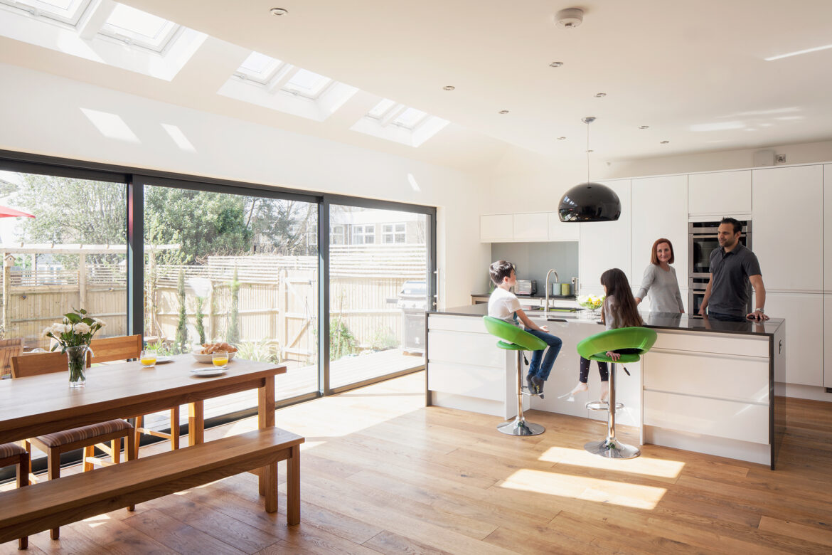
Once the dividing walls came down, a soaring double-height central living space emerged. The exposed beams, sanded and oiled to a soft honey tone, became the architectural centerpiece. Overhead, new skylights flood the interior with natural light, creating a sense of spaciousness that contrasts beautifully with the rugged textures of the old stone walls.


Materials: Old Meets New

Respecting the building’s original fabric was key. The renovation team sourced reclaimed brick and local stone to repair damaged walls, ensuring that any new insertions felt honest and harmonious. Large steel-framed windows replaced the small, irregular openings, drawing the landscape inside. The floor, once rough concrete and timber, was reimagined with wide oak planks that echo the warmth of the original beams.

In contrast to these natural materials, sleek black steel and polished concrete elements add a distinctly modern edge. The staircase, for instance, is an elegant ribbon of folded metal that seems to hover weightlessly against the stone wall. This deliberate contrast between rough and refined gives the home its unique character.


A Loft-Inspired Interior

Although the structure retains its rustic bones, the interior takes cues from urban loft design. Open-plan living dominates the ground floor, with the kitchen, dining, and sitting areas flowing seamlessly into one another. A minimal palette of whites, charcoals, and natural wood creates a clean backdrop for carefully curated furniture pieces.

The kitchen is anchored by a large concrete island, its surface slightly textured to catch the light. Overhead, pendant lamps cast soft, warm pools of illumination. A mix of vintage and contemporary pieces gives the space a layered, personal feel: an Eames chair by the window, a mid-century cabinet salvaged from a London auction, hand-thrown ceramics from local artisans lining open shelves.

Upstairs, a mezzanine level hosts a private office and reading nook. A frameless glass balustrade ensures uninterrupted sightlines across the main living area. The bedrooms, tucked beneath the original pitched roof, maintain a quiet, cocooning atmosphere — a deliberate contrast to the openness below.


Sustainable Choices

Throughout the renovation, sustainability played a central role. The couple installed underfloor heating powered by an air-source heat pump, significantly reducing energy consumption. The thick stone walls, once a practical means of insulation, now work in tandem with modern systems to regulate indoor temperature year-round.

Reclaimed materials were used wherever possible — not only for aesthetic reasons but to minimize waste. Even the roof tiles were carefully lifted, cleaned, and reused. The landscaping around the house was rewilded, encouraging native plants and pollinators to thrive.

Pages: 1 2

Advertising

There’s a quiet magic in walking through the gate of a country cottage and discovering that what lies beyond isn’t what you expect. This small, whitewashed home in the rolling hills of Oxfordshire looks, from the outside, every bit the picture of English restraint. The windows are simple. The roof, a soft grey slate. The path, perfectly neat. But step through the back door, and the house opens up into a world of contradictions — a minimalist interior that lets the garden outside burst into full, glorious abundance.

This project, completed earlier this year, is a perfect example of a growing design movement: minimalist interiors paired with lush, maximalist gardens. It’s a deliberate contrast that celebrates simplicity indoors while embracing joyful excess outdoors. And in the hands of the homeowners — a landscape designer and a ceramic artist — the effect is utterly enchanting.


A Quiet House with a Thoughtful Design

The cottage itself is over 150 years old, a typical two-up, two-down structure with modest rooms and low ceilings. When the couple bought it five years ago, it was in good shape but had been modernised in the 1990s in a way that stripped it of personality. Beige carpets, bulky radiators, and standard-issue fittings made it feel uninspired.

Rather than restoring it to some imagined “chocolate box” ideal, the owners opted for something more restrained: a clean, minimalist interior that honours the building’s scale. Walls were painted a warm white, window frames were restored and left bare of curtains, and the floors were replaced with pale oak boards that run continuously through the house. The effect is quiet, timeless, and intentional.

“It wasn’t about making it bigger or grander,” says co-owner and designer Michael Langley. “It was about creating a space that would feel like a backdrop. We always knew the garden would be the real star.”


Minimalism That Feels Warm, Not Cold

Minimalism often brings to mind stark, empty rooms and hard surfaces, but this cottage demonstrates a softer, more British interpretation. Rather than striving for architectural perfection, the owners focused on editing down their belongings and choosing materials that would age gracefully.

The living room, for example, features just a handful of carefully selected pieces: a linen sofa, a mid-century oak armchair, a ceramic lamp, and a single abstract artwork. The walls are untouched except for the soft shadows cast by daylight. In the kitchen, open shelving holds hand-thrown bowls and a few well-used copper pans. Everything has a function; nothing is ornamental for ornament’s sake.

“Minimalism doesn’t mean empty,” Michael explains. “It means intentional. Every object here earns its place.”

This intentional restraint has an unexpected effect: it makes the home feel larger than it is. By eliminating visual clutter, the cottage breathes. But it also sets the stage for what happens the moment you step outside.


A Garden That Refuses to Whisper

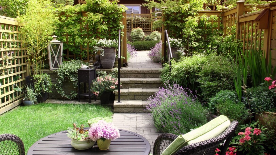
If the house speaks in soft tones, the garden sings at full volume. From the back door, the ground slopes gently into a series of wild, overflowing flowerbeds. Every inch is filled with life: peonies the size of teacups, foxgloves swaying in the breeze, climbing roses tumbling over trellises, and a thick border of lavender releasing its scent on warm days.

This is not a manicured garden in the formal sense. It’s exuberant, layered, and intentionally a little unruly. Michael, who works as a landscape designer, describes it as “a maximalist experiment that never stops evolving.”

“I’ve always loved gardens where everything feels slightly too much,” he says, smiling. “The kind where plants compete for space and colour blends together like paint on a canvas.”

The planting follows a loose structure — a framework of paths and terraces — but the beds themselves are dense and chaotic by design. Instead of sticking to a limited palette, the couple embraced variety: rich burgundy dahlias, sunny yellow achillea, frothy white cow parsley, and delicate pink astrantia all coexist in a joyful, naturalistic mix.


Controlled Chaos: The Art of Maximalist Planting

Maximalism in gardening isn’t about neglect. In fact, it often requires more planning than a restrained design. Michael carefully considered how the plants would grow, overlap, and change throughout the seasons. Tall perennials form the backbone, while creeping groundcovers and flowering climbers fill every gap.

A series of winding gravel paths cuts through the abundance, ensuring the space remains walkable and immersive. Each turn reveals a different composition: a row of towering hollyhocks, a small pond buzzing with dragonflies, a pergola wrapped in jasmine. There’s no single focal point — the garden is designed to pull the eye in every direction.

“It’s immersive,” says Michael. “You don’t stand back and look at the garden. You walk through it. It surrounds you.”

Even the planting strategy is layered. Early spring brings tulips and hellebores, summer bursts with colour and fragrance, and autumn shifts the palette to warm russets and golds. Winter, though quieter, still has structure thanks to evergreen shrubs and ornamental grasses left standing for texture.


Indoor and Outdoor: A Dialogue

One of the most striking aspects of the property is how the interior and garden speak to each other. The minimalist house doesn’t try to compete with the garden’s extravagance — it frames it. Large French doors open directly from the kitchen onto a stone terrace, allowing the view of the planting to act almost like living wallpaper.

From inside, the greenery becomes an ever-changing backdrop. In spring, it’s soft and delicate; in summer, it’s a riot of colour. In autumn, golden leaves create a painterly landscape. This fluid connection between indoors and outdoors gives the small house an extraordinary sense of space and atmosphere.

To enhance that connection, the couple made subtle design decisions. Window frames were left bare, floors inside and paving outside were chosen in similar tones, and the terrace was built at the same level as the kitchen floor, eliminating visual barriers.

“It’s like the house spills out into the garden,” says Michael. “And the garden flows back inside.”

Pages: 1 2

Advertising

There’s a particular kind of calm that only exists by the sea. It’s in the soft salt air, the way sunlight bounces off pale sand, and the muted rhythm of waves meeting the shore. For years, coastal aesthetics have been associated with holiday homes, seaside cottages, and breezy getaways. But in 2025, that look — defined by light, texture, and an effortless connection to nature — is moving inland. From London terraces to converted warehouses in Manchester, coastal-inspired interiors are quietly reshaping urban homes across the UK.

This isn’t about seashell ornaments and striped deckchair fabric. The new wave of coastal design is subtle, modern, and deeply intentional. It’s about bringing a sense of ease, openness, and connection to nature into city living — no beach required.


A Desire for Calm in the City

Urban life has its own energy: fast, noisy, and wonderfully chaotic. But after years of uncertainty, more people are seeking a sense of calm in their daily environments. According to a 2025 report by The British Institute of Interior Design, natural light, soft colour palettes, and organic textures are among the top features homeowners now prioritise.

“The coastal look isn’t just about aesthetics,” says interior designer Clara Jennings, known for her soft, textural interiors. “It’s about how a space makes you feel. People want their homes to be soothing, like a deep breath after a long day.”

This emotional connection is what sets the current trend apart from the nautical kitsch of the early 2000s. Instead of literal beach themes, today’s urban coastal style is a carefully curated balance of lightness and tactility, built to withstand — and soften — the intensity of city life.


Light as a Design Element

One of the defining features of coastal interiors is the way they handle light. By the sea, sunlight often reflects off water and sand, filling rooms with a soft, diffused glow. Urban homes, especially those in the UK’s dense cities, don’t have the same natural advantage — but designers are finding creative ways to bring that brightness inside.

The most obvious change has been a shift toward pale, sun-washed colour palettes. Walls in creamy whites, warm greys, or pale blues bounce light around rooms, creating an airy feel even in the gloomiest weather. Instead of cold white light, designers are favouring warmer tones, mimicking the softness of natural daylight on a coastal morning.

Large mirrors are another subtle trick, positioned to reflect light deeper into spaces. In some London flats, owners are replacing heavy curtains with linen drapes that filter sunlight rather than block it. This gentle play of light creates a softness that can make even the most urban interior feel connected to the outdoors.


Texture Over Pattern

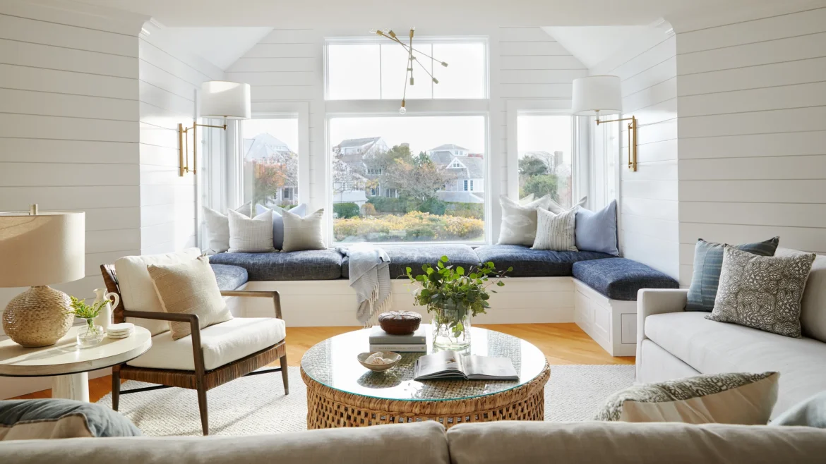
The modern coastal aesthetic leans less on overt patterns and more on touchable, natural textures. Think raw linen, rattan, brushed wood, soft boucle, and hand-thrown ceramics. These materials give spaces a tactile warmth that evokes the organic imperfection of the seaside without needing any literal references.

“Texture creates atmosphere,” explains Clara. “When you step barefoot onto a jute rug or run your hand over a limewashed wall, you’re grounding yourself in a sensory experience. It’s a small, daily reminder to slow down.”

In urban lofts, industrial materials are being softened with woven textiles. Concrete walls are paired with driftwood-inspired oak furniture. Metal fixtures are balanced with clay lampshades or woven pendant lights. The key is restraint: a few natural textures are more powerful than a cluttered collection of beach-inspired accessories.


Muted Blues, Soft Neutrals, and Earthy Accents

The coastal palette has evolved far beyond bright navy stripes and anchor motifs. Instead, muted tones now define the trend: chalky whites, seafoam greens, sand beiges, warm taupes, and soft blues inspired by overcast skies rather than postcard sunsets.

This shift reflects a wider move toward subtle, layered interiors that age gracefully. In kitchens, shaker-style cabinetry in warm grey or sage is paired with pale stone worktops and brushed brass handles. Living rooms feature natural wood floors, light upholstery, and the occasional pop of sea-glass green in cushions or art. Bedrooms lean on soft linen bedding and woven throws, making them feel cocoon-like rather than themed.

Colour consultants have noted a surge in demand for paint shades inspired by the British coastline, with brands like Farrow & Ball and Little Greene releasing coastal-inspired collections that are anything but obvious.


Borrowing Space From the Outdoors

Perhaps the most compelling aspect of coastal design is its connection to nature. Even in the most urban settings, homeowners are finding ways to blur the boundaries between indoors and outdoors. One of the most popular methods is the integration of natural light and greenery.

Large windows or French doors open onto small terraces, balconies, or rooftop gardens, creating a seamless transition between interior and exterior spaces. Where architecture doesn’t allow such structural changes, designers are turning to clever solutions: large houseplants like olive trees, soft window treatments, and pale timber furniture help mimic the relaxed atmosphere of a garden by the sea.

Roof terraces and tiny patios are being transformed into coastal retreats, with weathered wooden furniture, pale stone pavers, and climbing greenery. Even a small Juliet balcony can host a bistro table, a pot of lavender, and the illusion of a seaside breeze.


A Shift Toward Sustainable Materials

The coastal aesthetic naturally aligns with the growing emphasis on sustainability. By favouring organic materials, handcrafted objects, and timeless designs, it encourages longevity over seasonal trends. Instead of synthetic finishes and mass-produced décor, homeowners are investing in quality pieces that tell a story.

“We’re seeing a return to craftsmanship,” says Clara. “People are buying fewer but better things — a handmade ceramic lamp, a woven rattan chair, a reclaimed wood dining table. These pieces bring soul to a space.”

This preference also reflects broader lifestyle shifts. As climate concerns grow, many urbanites are consciously seeking designs that feel closer to nature, both aesthetically and ethically.


Coastal Design Without Clichés

One of the biggest misconceptions about coastal design is that it requires a literal interpretation: seashells, anchors, starfish, or striped deckchairs. The modern approach avoids such clichés entirely. Instead, it draws inspiration from the essence of coastal life — simplicity, airiness, and connection to the environment.

In a London townhouse, that might mean limewashed walls, timber flooring, and sculptural vases in ocean-inspired hues. In a Manchester loft, it could translate into airy curtains, soft linen sofas, and light flooding through steel-framed windows. The key is subtlety.

Designers often speak of the “coastal state of mind” — a feeling of ease and openness. Capturing that doesn’t require proximity to the sea; it requires a thoughtful layering of space, light, and texture.

Pages: 1 2

Advertising

Bath has always had a way of capturing the imagination. With its honey-coloured stone, elegant crescents, and cobbled streets that seem to whisper stories of centuries past, the city holds an undeniable charm. At the heart of this architectural heritage is a recently restored Georgian townhouse that blends historical elegance with a quietly modern touch — a project that’s turning heads not only in the city itself but across the UK’s design community.

Walking through the heavy front door of this four-storey home feels a little like stepping through time. The townhouse, built in the late 18th century, had stood silently for decades, its bones sound but its spirit tired. Now, after a meticulous two-year restoration, it’s breathing again — light, elegant, and deeply rooted in its heritage.


A Building with a Story

Bath’s Georgian townhouses aren’t just pretty façades. They were built during a period of ambitious urban planning, when the city was the darling of English high society. This particular house was part of a terrace commissioned in the 1790s, with characteristic sash windows, ornate cornicing, and a perfectly symmetrical façade.

By the time its current owners, a couple from London looking to move westward, discovered it, the house had seen better days. Water damage had crept in through the roof, layers of poorly chosen wallpaper covered delicate plasterwork, and the once-grand staircase was creaking with exhaustion. But beneath the wear and tear, the original craftsmanship remained astonishingly intact.

“It wasn’t about creating something new,” says interior designer Sophie Turner, who led the restoration. “It was about revealing what was already here.”


Balancing Heritage and Modern Living

One of the greatest challenges with any historic property is striking a balance between preservation and practicality. Georgian homes, beautiful as they are, weren’t built with modern life in mind. Narrow staircases, small kitchens tucked into basements, and draughty windows can make them difficult to live in comfortably. But the owners were adamant: they wanted to respect the building’s character, not erase it.

The design team approached the project with a philosophy of “gentle intervention.” Rather than gutting the structure, they worked carefully within its framework. Period details — cornices, mouldings, ceiling roses, and even fragments of original paintwork — were conserved and restored where possible. Modern interventions were introduced subtly, often hidden in plain sight.

The kitchen, for example, now occupies what was once a service basement. Instead of fighting the low ceilings and uneven floors, the designers leaned into the building’s quirks. Bespoke joinery in pale oak was crafted to fit the irregular space, while a cool stone floor nods to the materials of the period. A long, farmhouse-style table brings warmth and functionality, turning the kitchen into the social heart of the home.

“It’s not about perfection,” Sophie explains. “It’s about layering old and new so they speak to each other.”


Light, Air, and a Sense of Flow

A key part of the restoration was bringing light back into the building. Over the years, dark paint, heavy curtains, and poorly placed partitions had made the interior feel claustrophobic. The team stripped away the excess, revealing tall windows that flood the rooms with the soft, golden light Bath is known for.

On the first floor, where the grand drawing room sits, the walls are painted in a chalky off-white that reflects the light without feeling harsh. The original fireplace has been carefully cleaned and reinstalled, surrounded by a mix of antique and contemporary furniture. A velvet sofa in a muted green adds a touch of colour, while artwork by British printmakers brings subtle modernity.

Rather than creating stark contrasts, the designers opted for a layered palette: soft greys, earthy ochres, and warm neutrals. The result is a space that feels calm, lived-in, and timeless — as if it has always been this way.


Respecting the Past Through Materials

Materials tell the story of any building, and in this house, they play a starring role. Wherever possible, the team used traditional methods and natural finishes: lime plaster instead of cement, reclaimed timber instead of modern laminate, and handmade tiles sourced from British artisans.

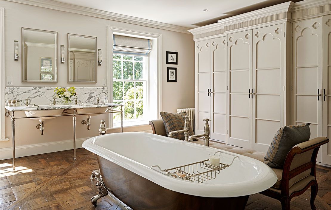
In the bathrooms, for example, rather than installing shiny new fixtures, they opted for classic roll-top baths and brushed brass taps that will age gracefully over time. In the hallway, the original flagstones were lifted, cleaned, and relaid, their uneven surfaces whispering centuries of footsteps.

Even the colour palette was guided by history. Paint analysis revealed traces of soft blues and creams from the early 19th century. Inspired by these findings, the team recreated period-appropriate shades that feel authentic without being overly “museum-like.”

“We wanted the house to age beautifully,” says Sophie. “Everything we chose was meant to settle in, not to shout.”

Pages: 1 2

Advertising