Category:

Style Guide

Advertising

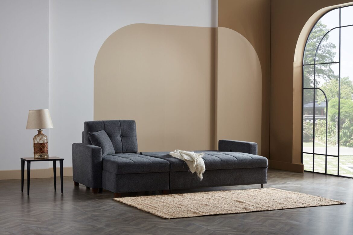
Small rooms can feel cozy and intimate, but when they feel cramped or claustrophobic, the mood and usability of the space can suffer. One of the most effective ways to counter this is through wall colour. In 2025, interior designers across the UK are increasingly using carefully chosen hues to enhance spatial perception, creating rooms that feel brighter, airier, and more expansive — without knocking down a single wall.

Wall colour is not just a decorative decision; it shapes light, depth, and emotion, influencing how space is experienced. Here’s a detailed guide to choosing colours that make small rooms feel larger.


Understanding the Psychology of Colour

Before selecting a colour, it’s important to understand its psychological and perceptual effects:

  • Light colours: Whites, creams, soft pastels, and pale greys reflect more light, making walls appear to recede and spaces feel open.

  • Cool tones: Blues, greens, and muted purples can create a sense of distance and calm, giving the impression of a larger, more tranquil room.

  • Warm tones: Soft beige, blush, or light peach can add coziness while still keeping the room feeling spacious if used correctly.

  • Monochromatic schemes: Using variations of one colour across walls, ceilings, and even trims creates a seamless look, reducing visual breaks and enhancing the perception of space.

Understanding how different hues interact with natural and artificial light is crucial to achieving a sense of expansiveness.


Rule 1: Use Light and Reflective Colours

Light, reflective wall colours are the simplest trick for enlarging small rooms:

  • Classic whites: Crisp whites amplify daylight, creating a bright, airy feeling.

  • Soft neutrals: Creams, light taupes, and pale greys add warmth without sacrificing openness.

  • Reflective finishes: Satin or eggshell paints bounce light subtly, enhancing the room’s luminosity.

Avoid dark, highly saturated colours on all walls, as they tend to absorb light and make the room feel smaller.


Rule 2: Extend Walls Visually

Creating continuity between walls, ceilings, and trim reduces visual breaks, making the space appear larger:

  • Ceiling continuity: Painting the ceiling the same colour as the walls or a slightly lighter shade creates a seamless vertical plane.

  • Unified trim: Match skirting boards, architraves, and door frames to wall colour to reduce visual interruptions.

  • Minimal contrast: Strong colour contrasts between walls and trim can make the room feel compartmentalised and smaller.

This technique tricks the eye into perceiving a continuous, expansive space.


Rule 3: Use Cool Tones for Depth

Cool colours recede visually, creating an impression of more space:

  • Soft blues: Pale, dusty blues suggest openness and calm.

  • Muted greens: Sage or mint tones bring freshness while subtly expanding perception.

  • Lavender and lilac: Light, muted purples offer softness and depth.

Pairing cool tones with plenty of natural light maximises their spatial effect.


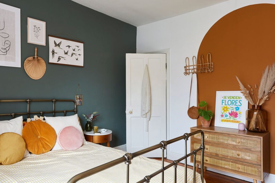
Rule 4: Employ Accent Walls Strategically

Accent walls can add personality without shrinking the room:

  • Light accent: Choose a slightly darker shade of the main wall colour to create dimension.

  • Vertical accents: Subtle vertical stripes can make ceilings appear higher.

  • Avoid heavy patterns: Bold, dark patterns can dominate a small room and reduce perceived space.

A carefully considered accent draws the eye, enhancing depth rather than creating confinement.


Rule 5: Use Monochromatic and Tonal Variations

Monochromatic schemes elongate and unify the space:

  • Walls and furniture: Choose furniture and soft furnishings in complementary shades of the wall colour.

  • Flooring: Light-coloured flooring in the same tonal family extends the visual plane.

  • Textiles: Rugs, cushions, and curtains in similar tones maintain cohesion.

The eye perceives fewer breaks, making the room feel open and airy.

Pages: 1 2

Advertising

Bathrooms are more than just functional spaces — they are personal retreats, sanctuaries where we start and end our day. In 2025, bathroom design has evolved beyond purely practical considerations, emphasizing timeless style, durability, and comfort. A well-designed bathroom combines aesthetics, function, and longevity, ensuring it remains stylish and practical for years to come. Unlike trend-focused spaces that quickly feel dated, a timeless bathroom endures both in style and usability.

Creating such a space requires a careful balance of materials, layout, lighting, and subtle detailing. Here’s a comprehensive guide to the essential rules for designing a bathroom that stands the test of time.


Rule 1: Prioritize Functionality and Layout

A timeless bathroom begins with a thoughtful layout:

  • Ergonomic flow: Ensure toilets, sinks, showers, and bathtubs are arranged for comfort and easy movement.

  • Adequate storage: Cabinets, drawers, and built-in niches reduce clutter, maintaining clean lines.

  • Zoning: Wet and dry zones prevent water spillage and improve hygiene.

  • Accessibility: Plan for ease of use for all ages, including future-proofing for mobility needs.

By focusing on function first, the bathroom will remain practical and enjoyable regardless of style trends.


Rule 2: Choose Classic Materials

Materials define the longevity and aesthetic of a bathroom. Timeless spaces rely on quality, durable finishes:

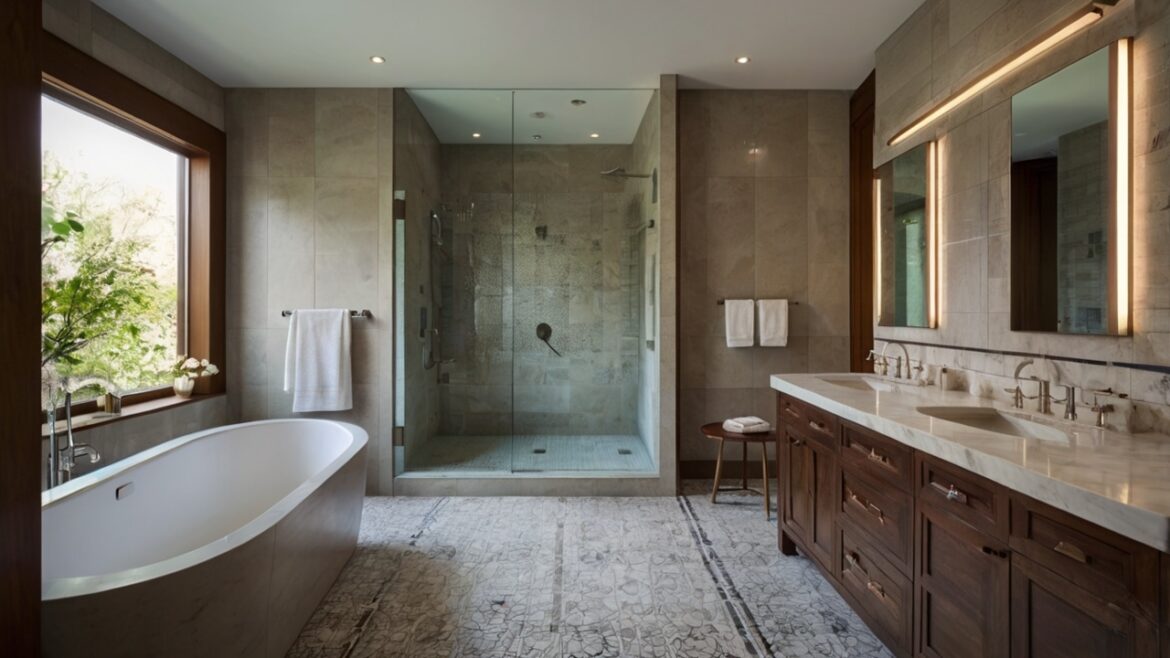
  • Stone and porcelain tiles: Marble, limestone, or large-format porcelain tiles provide elegance and resilience.

  • Natural timber accents: Teak or oak vanities add warmth and contrast against cooler surfaces.

  • Glass: Clear or frosted glass partitions and shower screens maintain openness and light.

  • Metals: Brushed nickel, chrome, or matte black fittings are both durable and versatile.

Avoid overly trendy materials that may date quickly. Instead, select finishes that balance durability with understated elegance.


Rule 3: Opt for Neutral and Balanced Colour Palettes

Colour contributes heavily to the timeless quality of a bathroom:

  • Neutral base: Whites, creams, greys, and soft beiges create a clean, serene backdrop.

  • Accents: Introduce subtle colour through towels, accessories, or tile mosaics rather than large bold surfaces.

  • Contrast: Light walls with slightly darker floors or vice versa enhance depth and sophistication.

  • Consistency: Maintain a harmonious palette across surfaces and fixtures to avoid visual clutter.

Neutral schemes not only endure trends but also make spaces feel brighter and larger.


Rule 4: Invest in Quality Fixtures

High-quality fixtures contribute to longevity and elevate a bathroom’s design:

  • Vanities: Solid, well-crafted cabinets resist warping and moisture damage.

  • Taps and showerheads: Durable metals with reliable mechanisms ensure consistent performance.

  • Baths and basins: Freestanding tubs or integrated basins with smooth lines combine form and function.

  • Toilets and bidets: Consider comfort height and water efficiency alongside design.

Investing in quality components reduces maintenance and ensures the bathroom remains enjoyable for years.


Rule 5: Embrace Clean Lines and Minimalism

Timeless bathrooms often favour simplicity over ornate detailing:

  • Streamlined cabinetry: Handleless doors or discreet pulls create a modern, uncluttered appearance.

  • Integrated storage: Hidden drawers and recessed shelving maintain clean surfaces.

  • Simple silhouettes: Sleek bathtubs, basins, and mirrors age gracefully and complement various design elements.

  • Clutter-free zones: Keep countertops minimal to maintain serenity.

Minimalism enhances longevity because simple, uncluttered spaces are less likely to feel dated.


Rule 6: Layer Lighting Thoughtfully

Lighting transforms both the function and mood of a bathroom:

  • Ambient lighting: Ceiling-mounted or recessed lights provide even illumination.

  • Task lighting: Mirror-mounted or wall lights eliminate shadows for grooming.

  • Accent lighting: LED strips under vanities or in niches create warmth and highlight design features.

  • Natural light: Maximise windows or skylights where possible for bright, energising daylight.

Combining layers ensures usability while creating an inviting atmosphere at any time of day.


Rule 7: Incorporate Texture and Subtle Detail

Texture prevents neutral, minimalist spaces from feeling sterile:

  • Wall finishes: Matte tiles, textured wallpapers, or plaster can introduce tactile interest.

  • Flooring: Wood-effect tiles, stone, or patterned porcelain add depth without overwhelming.

  • Accessories: Woven baskets, ceramic jars, or soft towels contribute warmth and tactility.

Subtle contrasts between smooth, rough, and soft surfaces create a dynamic yet understated environment.

Pages: 1 2

Advertising

Mixing vintage and modern elements has become one of the most compelling trends in contemporary interior design. Across the UK, homeowners are embracing this approach to create spaces that feel curated, layered, and uniquely personal. By juxtaposing historical charm with sleek contemporary pieces, interiors gain depth, narrative, and a sense of timelessness. However, achieving a harmonious mix requires more than simply placing an antique chair beside a modern sofa — it demands strategy, sensitivity, and a step-by-step approach.

In 2025, mixing vintage and modern is less about imitation or matchy-matchy design and more about creating a dialogue between eras, textures, and forms.


Step 1: Understand Your Space and Its Potential

Before introducing vintage or modern pieces, it is essential to assess the room:

  • Architectural features: Identify original elements such as fireplaces, cornices, sash windows, and floorboards. These features often dictate how modern pieces can be integrated.

  • Natural light: Bright, north-facing rooms may handle darker vintage furniture, while south-facing rooms can accommodate bolder colours and finishes.

  • Functionality: Consider how the space is used — a living room, dining area, or bedroom will have different requirements for comfort, flow, and usability.

Understanding these factors ensures that vintage and modern elements are placed thoughtfully rather than haphazardly.


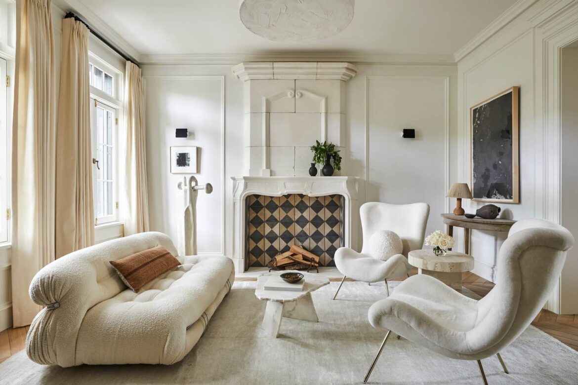
Step 2: Establish a Neutral Base

A neutral foundation allows both vintage and modern pieces to shine without visual chaos:

  • Walls and ceilings: Soft whites, greys, or muted pastels create a flexible backdrop.

  • Flooring: Wood, stone, or neutral carpets provide a canvas for layering textures and periods.

  • Large furnishings: Sofas, beds, or rugs in neutral tones anchor the room, allowing statement vintage items to become focal points.

This approach prevents the room from feeling cluttered and provides coherence when mixing contrasting styles.


Step 3: Select Key Vintage Pieces

Vintage items bring character, history, and narrative to a room. Begin by identifying one or two standout pieces:

  • Furniture: A 1920s armchair, Victorian sideboard, or mid-century dining table.

  • Lighting: Retro chandeliers, brass desk lamps, or industrial pendants.

  • Decorative items: Mirrors, artworks, clocks, or ceramics with historical appeal.

Choose pieces that resonate personally and complement the room’s scale, light, and function. These elements anchor the vintage layer without overwhelming the contemporary framework.


Step 4: Introduce Modern Elements

Once the vintage layer is established, add modern pieces that provide contrast and functionality:

  • Furniture: Sleek sofas, minimalist tables, or modular shelving create clean lines against more ornate vintage items.

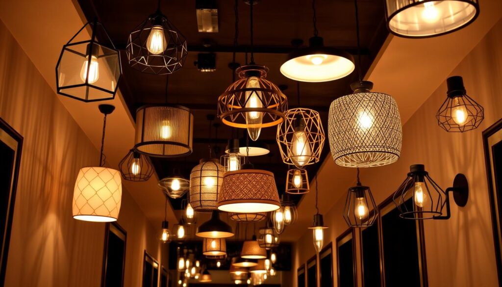
  • Lighting: Contemporary floor lamps, geometric pendants, or LED accents highlight modernity.

  • Accessories: Sculptural vases, abstract art, or textured rugs in neutral or bold tones inject freshness.

The key is balance: modern elements should frame and highlight vintage pieces, not compete with them.


Step 5: Layer Textures and Materials

Blending eras is as much about texture and material as it is about form or style:

  • Mix fabrics: Pair velvet armchairs with linen sofas or wool throws.

  • Combine metals: Brass, steel, and chrome can coexist, creating reflective and tactile contrast.

  • Introduce natural elements: Timber, stone, and ceramics help bridge vintage and modern aesthetics.

Layering textures ensures that the room feels cohesive and inviting, rather than visually fragmented.


Step 6: Consider Colour Harmony

Colour acts as the glue between vintage and modern pieces:

  • Echo tones: Repeat key colours from vintage pieces in modern accessories or fabrics.

  • Neutral bridging: Use whites, greys, and muted earth tones to soften contrasts.

  • Accent colours: Bold cushions, rugs, or artwork can tie the eras together dynamically.

Thoughtful colour choices prevent clashes and help the room feel deliberate and curated.


Step 7: Focus on Balance and Scale

When mixing periods, scale is critical:

  • Proportionate furniture: Ensure vintage and modern items are scaled to the room’s dimensions.

  • Visual weight: Heavier vintage furniture pairs well with lighter modern pieces to avoid imbalance.

  • Negative space: Allow breathing room around each item, preventing overcrowding and highlighting the individuality of pieces.

Balance ensures the room feels harmonious, not cluttered.

Pages: 1 2

Advertising

Lighting is one of the most powerful tools in interior design, yet it is often overlooked or treated as an afterthought. While natural light shapes the mood, perception, and functionality of a space during the day, artificial lighting is crucial for extending usability, enhancing atmosphere, and highlighting architectural features once the sun sets. In 2025, the key to sophisticated interior lighting lies in choosing fixtures that complement natural light, creating a seamless, harmonious transition between day and night.

This approach transforms interiors from static spaces into environments that respond to the rhythms of the day, enhancing wellbeing, aesthetics, and functionality.


Understanding Natural Light

Natural light varies depending on orientation, season, and architectural features. Understanding its qualities is essential before selecting artificial lighting:

  • Direction: North-facing rooms receive cooler, softer light, while south-facing spaces are warmer and more intense.

  • Intensity: Large windows, skylights, and reflective surfaces amplify daylight, while deep-set windows or shaded areas reduce it.

  • Colour temperature: Sunlight shifts subtly throughout the day — from warm golden hues at sunrise and sunset to cooler tones at midday.

  • Pattern and movement: Shadows, reflections, and changing light angles create dynamic effects on surfaces and textures.

Knowing how natural light interacts with a space allows designers to select complementary artificial lighting that enhances rather than clashes with daylight.


Layering Light: Ambient, Task, and Accent

Effective lighting design involves multiple layers, each serving distinct purposes:

  1. Ambient Lighting: The primary source that provides overall illumination, ensuring the room is comfortable and navigable.

    • Examples: Recessed ceiling lights, flush-mounted fixtures, or chandeliers.

    • Tip: Use dimmable options to adjust intensity according to natural light availability.

  2. Task Lighting: Focused illumination for specific activities like reading, cooking, or working.

    • Examples: Desk lamps, pendant lights over kitchen islands, under-cabinet lighting.

    • Tip: Position task lights to avoid glare while complementing daylight direction.

  3. Accent Lighting: Highlights architectural features, artwork, or decorative elements, adding drama and depth.

    • Examples: Wall washers, spotlights, LED strips.

    • Tip: Choose adjustable fixtures to adapt the focus as the angle and intensity of natural light change.

Combining these layers ensures interiors remain functional, dynamic, and visually appealing throughout the day.


Selecting Colour Temperature

The colour temperature of artificial lighting should harmonize with natural light to avoid visual dissonance:

  • Warm light (2700–3000K): Mimics sunrise and sunset tones; ideal for living rooms, bedrooms, and intimate spaces.

  • Neutral light (3500–4000K): Closely matches daylight; suitable for kitchens, bathrooms, and workspaces.

  • Cool light (5000K+): Mimics midday sun; useful for task-heavy areas or to energize a space, though overuse can feel sterile.

In rooms with strong natural light, softer or neutral artificial lighting prevents harsh contrasts, while in dim or north-facing spaces, warmer tones can create a welcoming glow.


Fixture Placement to Complement Sunlight

Strategic placement of lighting fixtures enhances the interplay with natural light:

  • Layer around windows: Wall sconces or floor lamps near windows provide consistent illumination during cloudy days or evenings.

  • Highlight textures: Pendant lights or directional spots can emphasize wood grains, brickwork, or textiles illuminated by daylight.

  • Avoid shadows and glare: Align task lighting perpendicular to natural light to reduce eye strain.

  • Reflective surfaces: Use mirrored or glossy finishes to bounce both natural and artificial light, enhancing brightness.

Proper placement ensures artificial light supports, rather than competes with, daylight.


Integrating Smart and Adaptive Lighting

Technology has transformed how artificial lighting interacts with natural light:

  • Dimmable systems: Adjust brightness according to ambient daylight levels.

  • Colour-adjustable bulbs: Shift temperature to match changing daylight hues.

  • Motion sensors: Automatically illuminate spaces when natural light is insufficient.

  • Scene-setting controls: Pre-programmed lighting sequences can simulate sunrise, sunset, or evening moods.

Smart lighting allows homes to respond dynamically to natural light, creating consistent visual comfort and energy efficiency.

Pages: 1 2

Advertising

In interior design, texture is as crucial as colour, light, or layout. It gives a room personality, depth, and a tactile quality that engages the senses. A monochrome wall, a sleek sofa, and polished floors can look stylish but may feel cold or flat. Layering textures transforms these spaces, turning them into inviting, visually rich environments that feel curated yet effortless. In 2025, mastering texture layering is a defining skill for both professional designers and discerning homeowners seeking interiors that feel alive, dynamic, and intimate.

Layering textures is more than simply mixing fabrics or finishes; it’s about creating harmony, contrast, and a tactile dialogue between elements. Done well, it elevates a room from aesthetically pleasing to memorably atmospheric.


Understanding Texture in Interior Design

Texture refers to the surface quality of materials, whether visual or tactile. Designers consider multiple forms of texture:

  • Tactile texture: How a surface feels to the touch — soft velvet, rough stone, smooth glass.

  • Visual texture: Patterns or surface detailing that the eye perceives, even if the surface is smooth — printed textiles, brushed metals, or patterned tiles.

  • Natural vs. synthetic: Organic textures like wood, wool, and linen versus man-made materials like acrylic, metals, or concrete.

  • Contrast and harmony: Layering involves balancing soft and hard, rough and smooth, matte and glossy surfaces to create depth.

Understanding these distinctions allows designers to intentionally combine elements, ensuring cohesion rather than chaos.


The Basics of Texture Layering

Layering textures successfully requires a balance between variety and restraint. Too little variation leads to flatness; too much creates visual confusion. Key principles include:

  • Start with a base texture: Typically a neutral surface like painted walls, timber flooring, or a plain rug.

  • Add mid-layer textures: Introduce tactile materials for furniture or drapery — linen sofas, velvet cushions, or wool throws.

  • Accent textures: Include smaller, high-impact elements like metal accessories, woven baskets, or glass décor to create points of interest.

  • Consider scale and proportion: Mix large surfaces (e.g., a wool rug) with finer textures (e.g., silk cushions) to avoid monotony.

This layered approach ensures depth and visual movement throughout the room.


Layering Fabrics

Textiles are the most immediate way to introduce layered textures:

  • Cushions and throws: Mix velvet, linen, silk, and cotton with different patterns and weights. For example, a linen sofa paired with velvet cushions and a chunky wool throw creates both visual and tactile contrast.

  • Curtains and drapes: Sheer curtains over heavier drapery add depth and soften sunlight, enhancing spatial warmth.

  • Rugs and carpets: Layering rugs — a flatweave under a textured shag or patterned rug — can define zones while adding richness.

  • Upholstery: Consider mixing textures within furniture pieces, such as a leather chair with a wool cushion or a velvet ottoman with linen seating.

The interplay of fabrics creates a dynamic, tactile experience that encourages touch as well as visual appreciation.


Combining Hard Surfaces

Layering textures is not limited to soft furnishings. Hard surfaces contribute equally to a room’s depth:

  • Wood finishes: Smooth polished wood, raw timber beams, or distressed floors add warmth and contrast.

  • Stone and marble: Polished granite, matte limestone, or textured tiles provide tactile and visual weight.

  • Metals: Brass, copper, stainless steel, and blackened iron create reflective and structural accents.

  • Glass and ceramics: Transparent, frosted, or patterned surfaces catch light and add subtle complexity.

By varying finishes, designers create interest and rhythm without overloading a space.

Pages: 1 2

Advertising